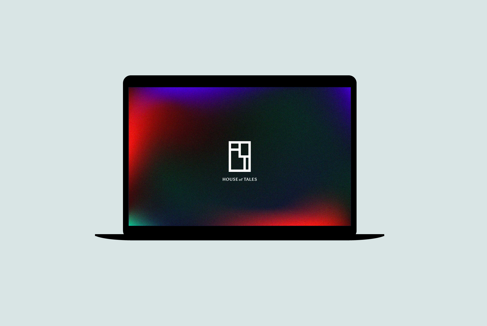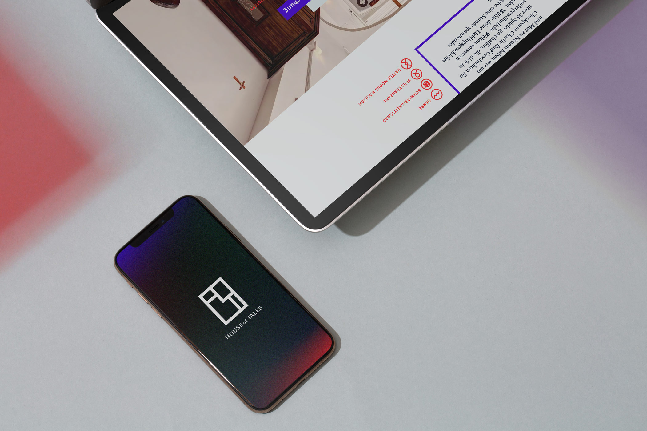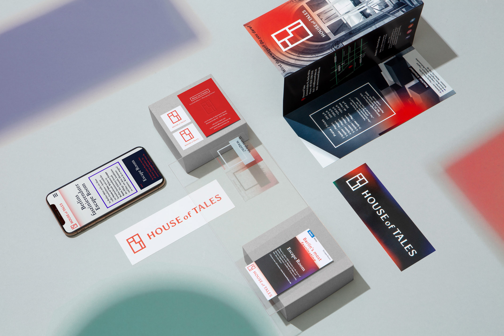
The floor plan is an important part of the puzzles in escape rooms and, together with the initials H, O and T, forms the logo.
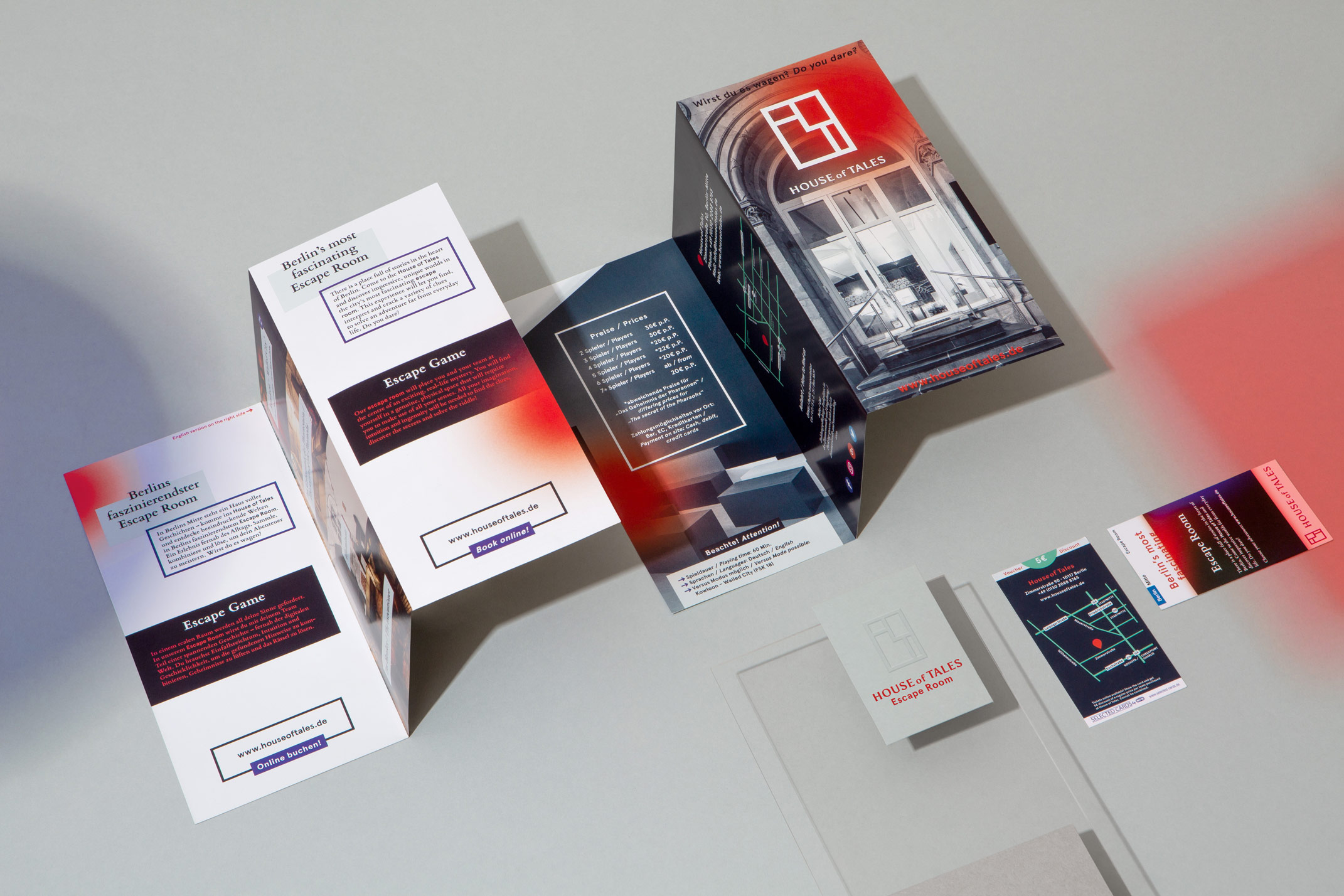
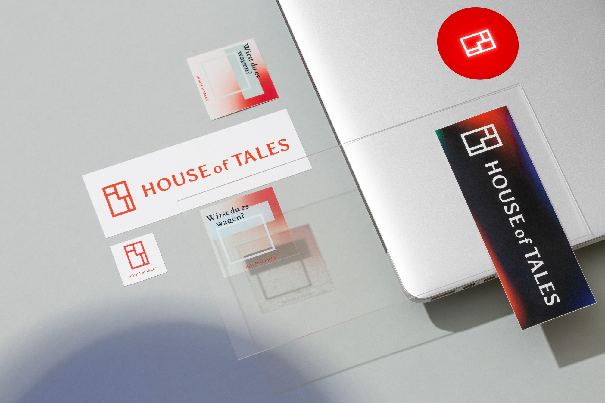
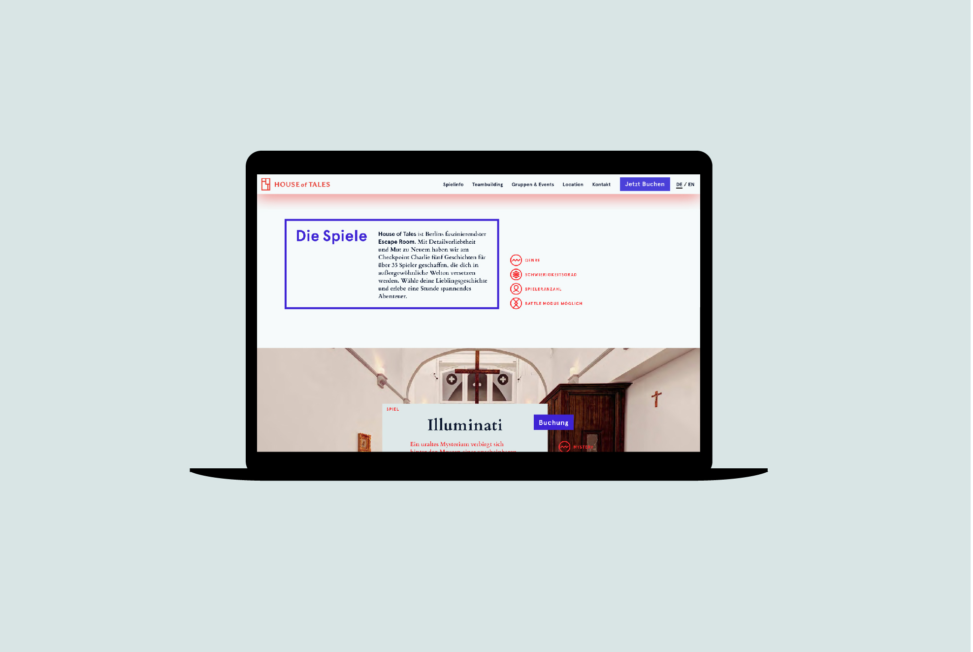
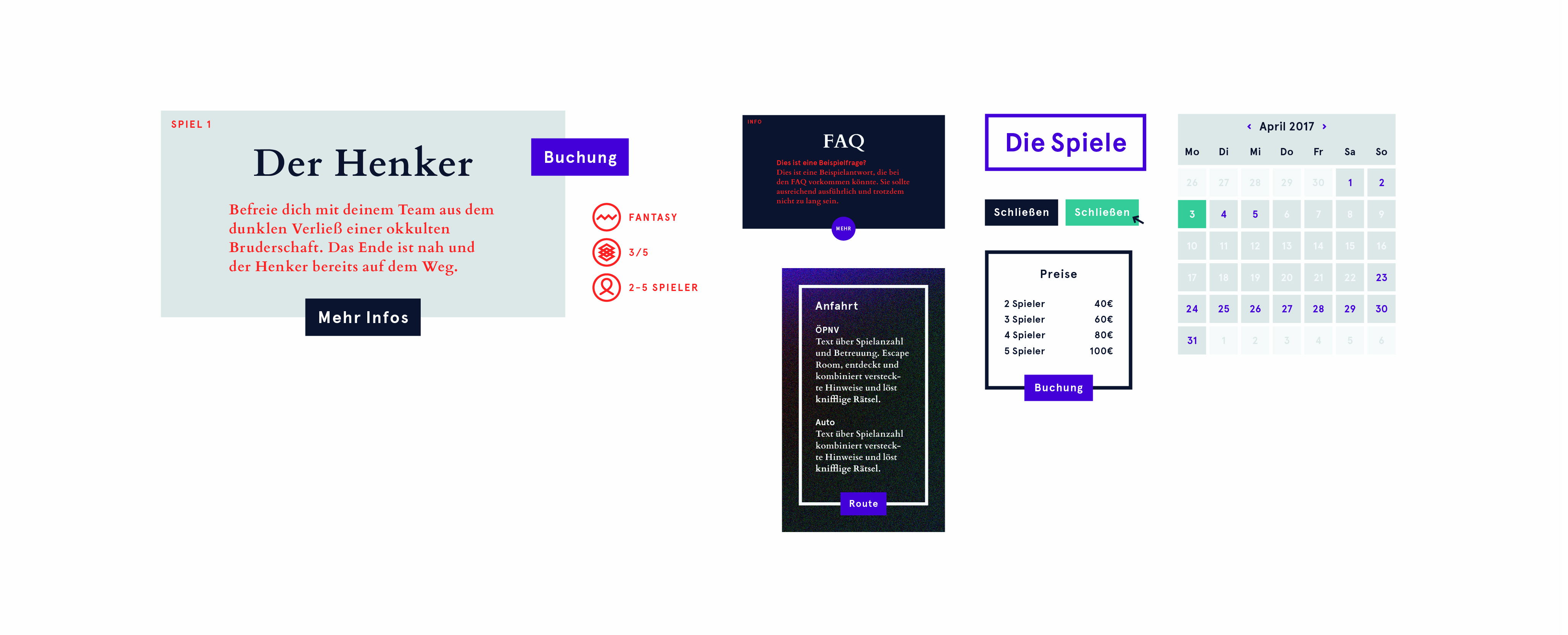
The elements used are uniformly applied in the digital and analogue sectors. The interplay of light and shadow and the layering of elements as a metaphor for changeable spaces can be seen on the flyer, the blind-embossed business cards, the interior and the transparent stickers.
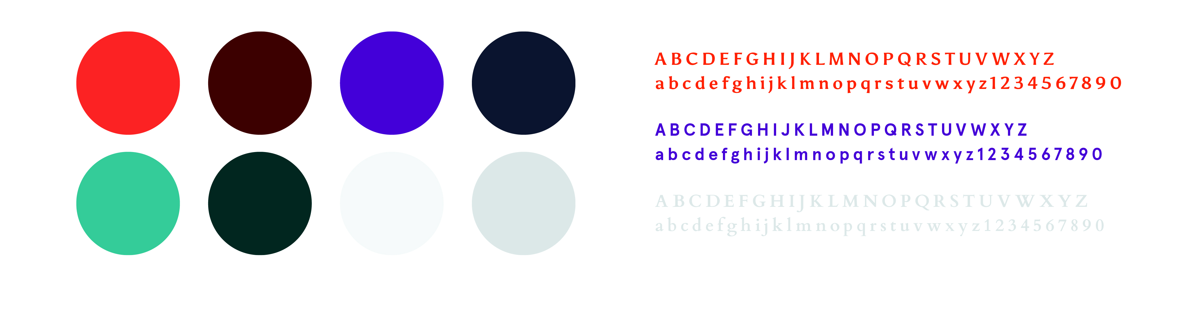
The visual translation was clear quite quickly: Overlapping surfaces loosen up and illustrate freedom, stubbornness and change, a clear surface with dark and accentuating bright colors, mysterious cones of light floating across the page and abstract icons looks modern and catches the eye - more exhibition, less nerdy. That's what the operators wanted.