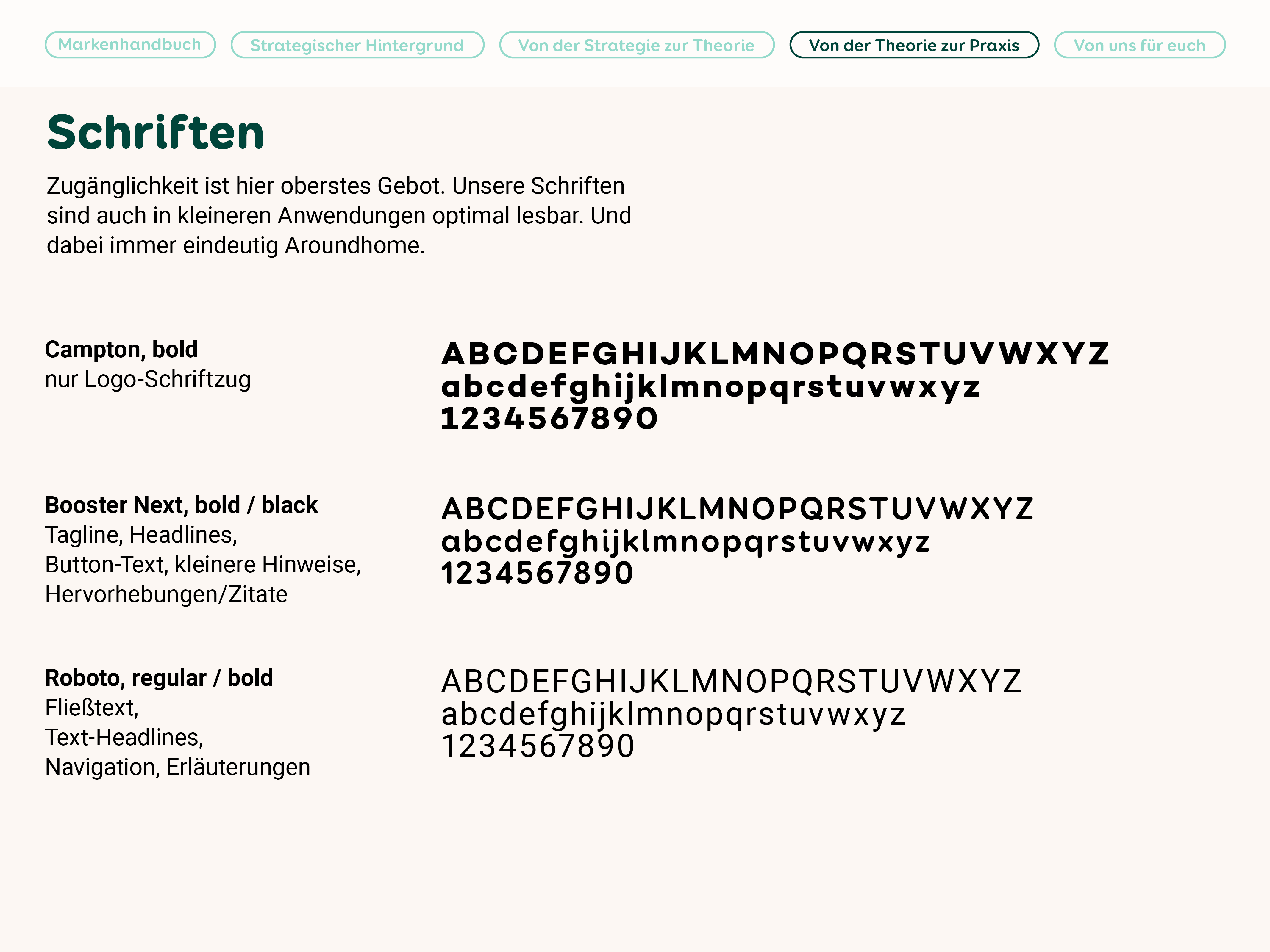
In joint workshops, JIN, Aroundhome and Toto quickly came to a common consensus: We want to create a sense of well-being with the design that - instead of appearing overloaded - supports the simplicity of the product and works better. Possible solutions were brighter, brighter colors that meet the requirements (more barrier-free, richer in contrast), a more exciting, but at the same time simpler image logo for the lettering (it should remain, because it works and is already recognized as an image-lettering combination) and a tidy layout system with inviting photos.
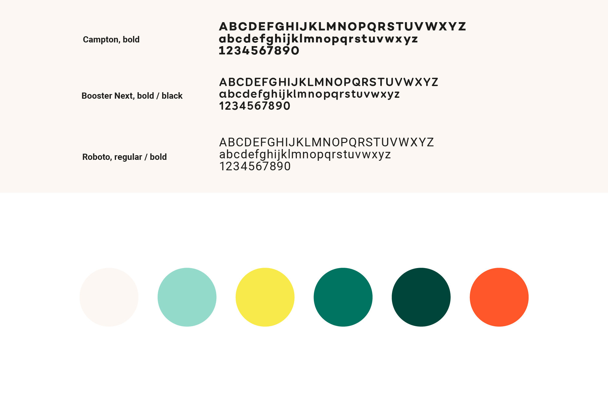
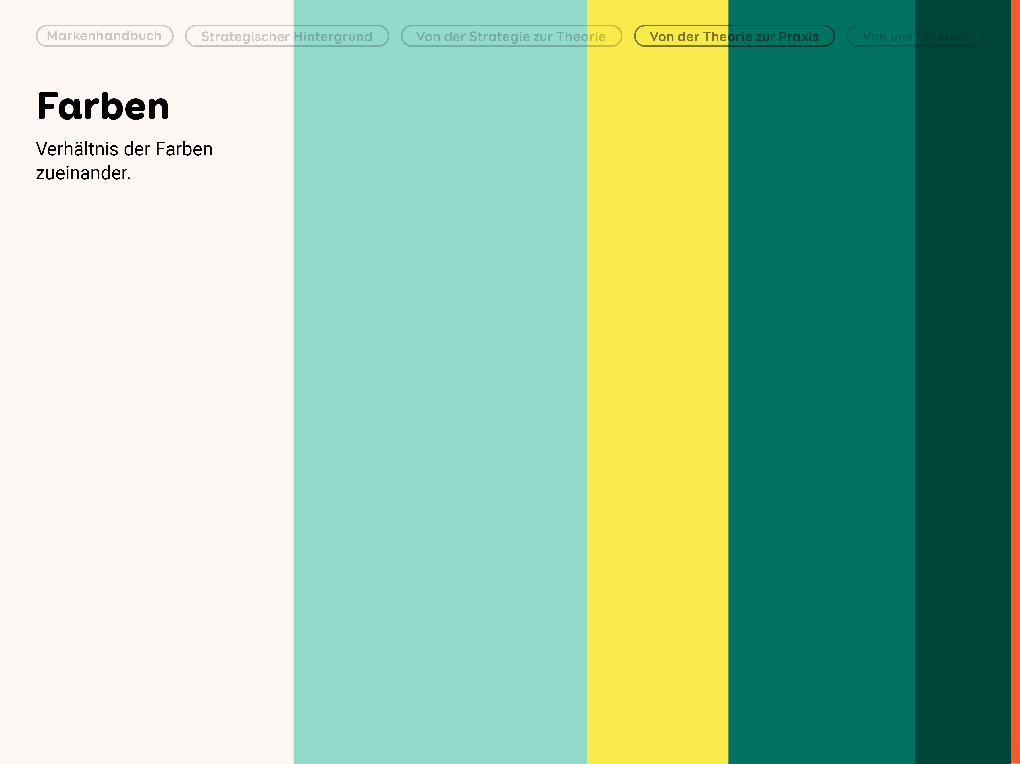
The two old CD colors were quite dark and dull. Some even gave the impression that it could be a garden center. We wanted to dust off the colors and pick up the new, younger target group with new freshness. In addition, other fixed colors were used to create visual hierarchies and increase legibility. A signal color should not be missing.
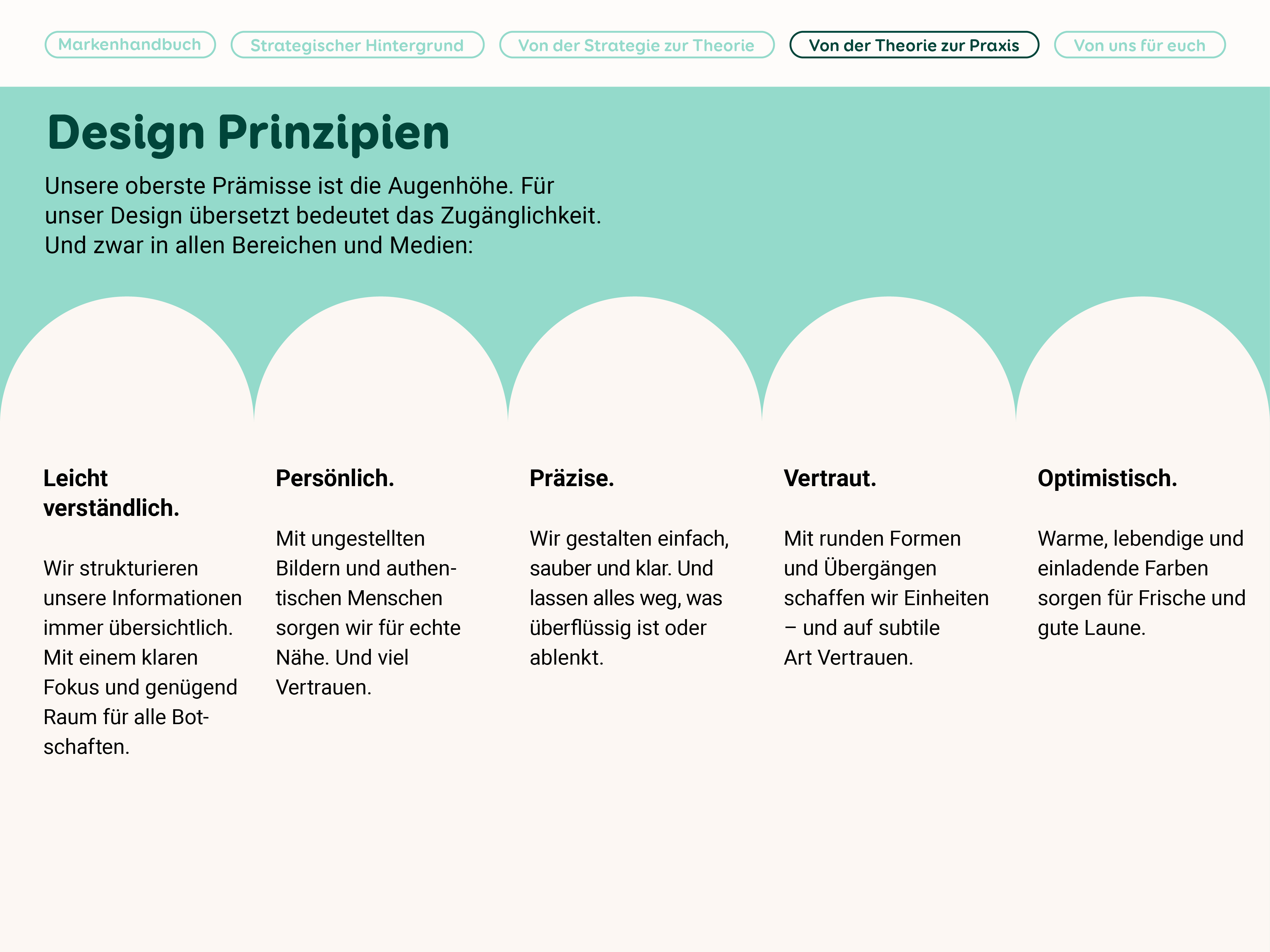
Create a sense of well-being instead of appearing overloaded
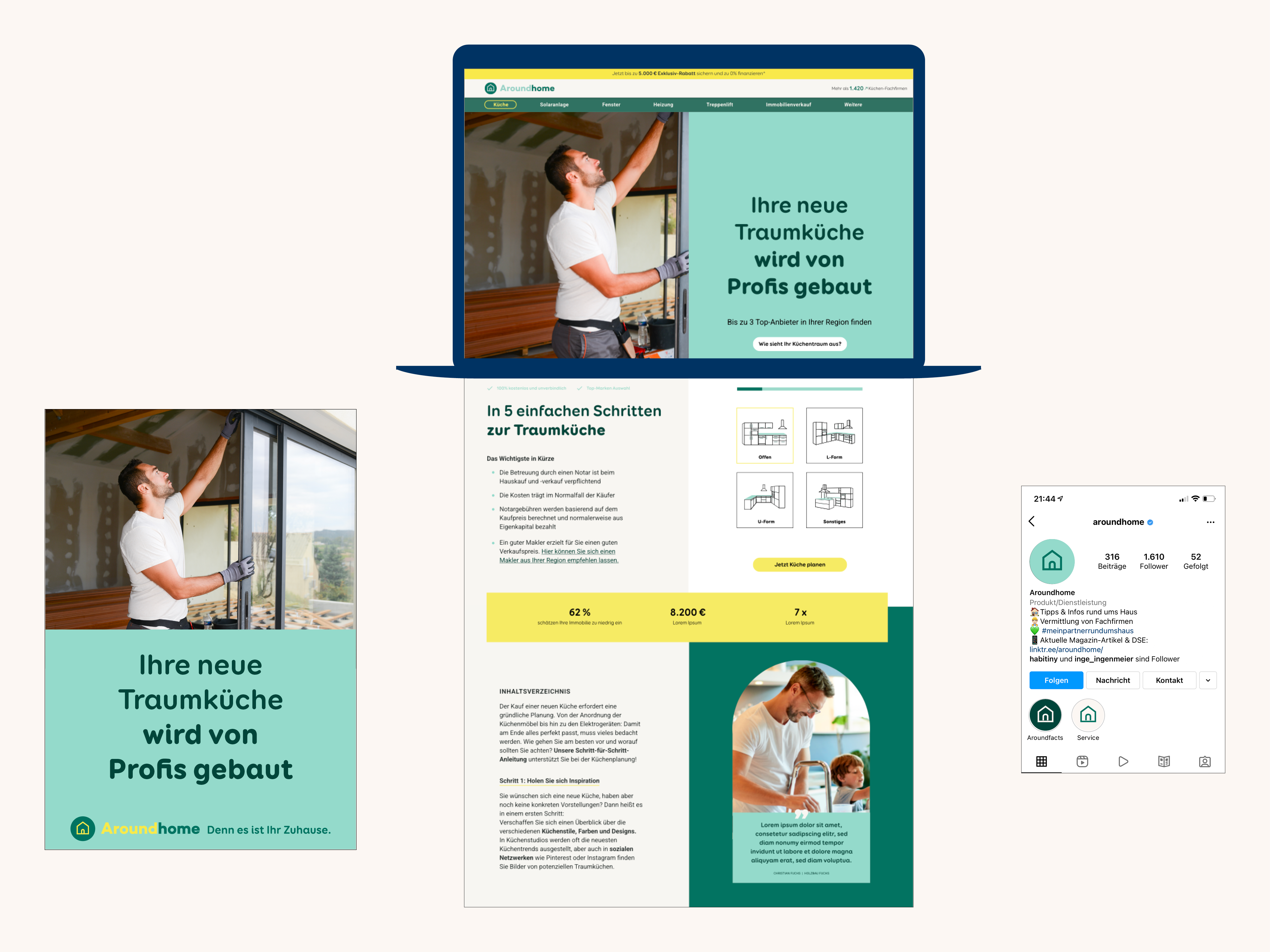
Art direction for JIN Berlin. Current status of the website (not from Studio Toto) https://www.aroundhome.de